Brand Development · Visual Identity · Marketing Design · Motion Design · Digital Design · Event Design
Overview
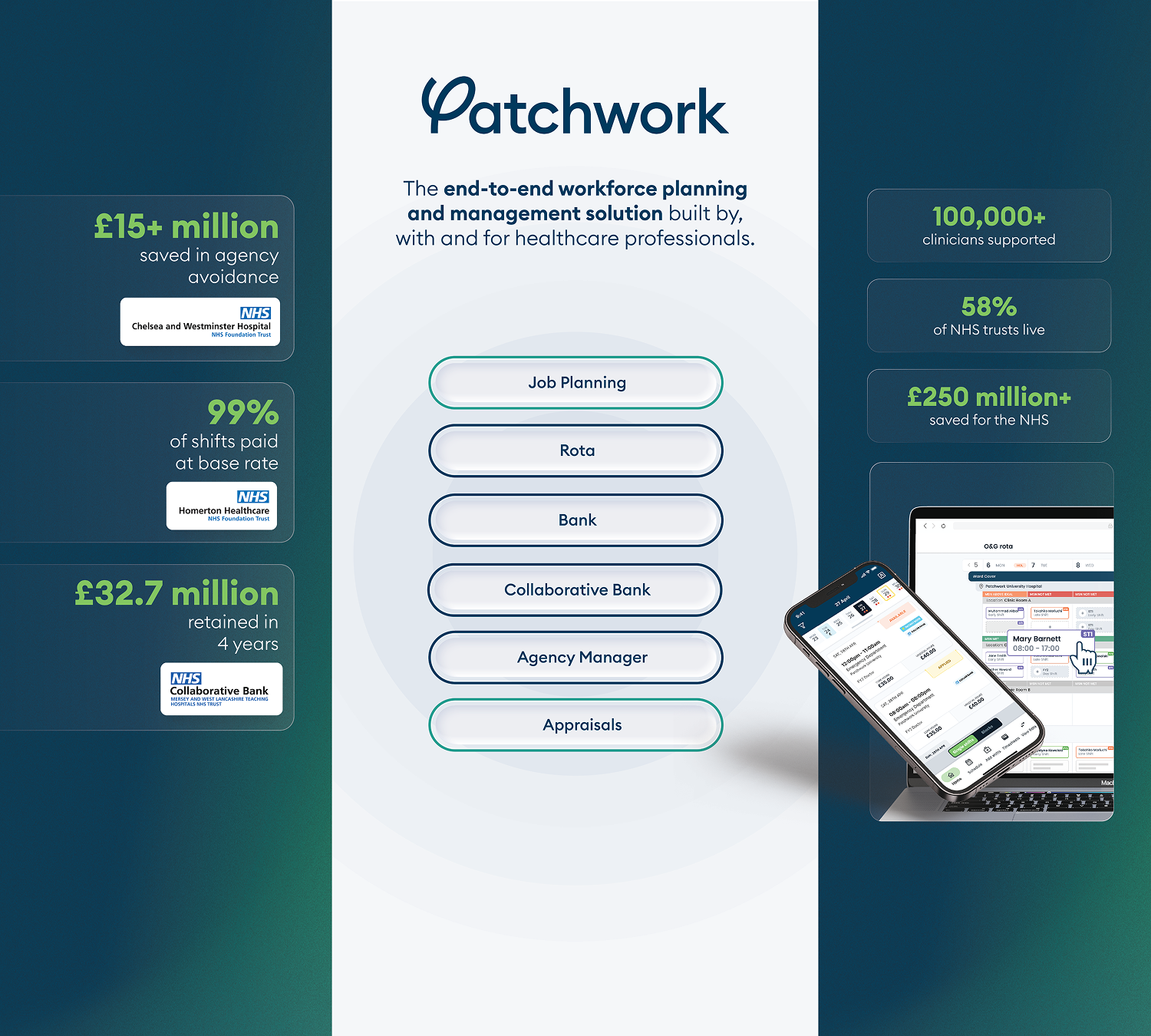
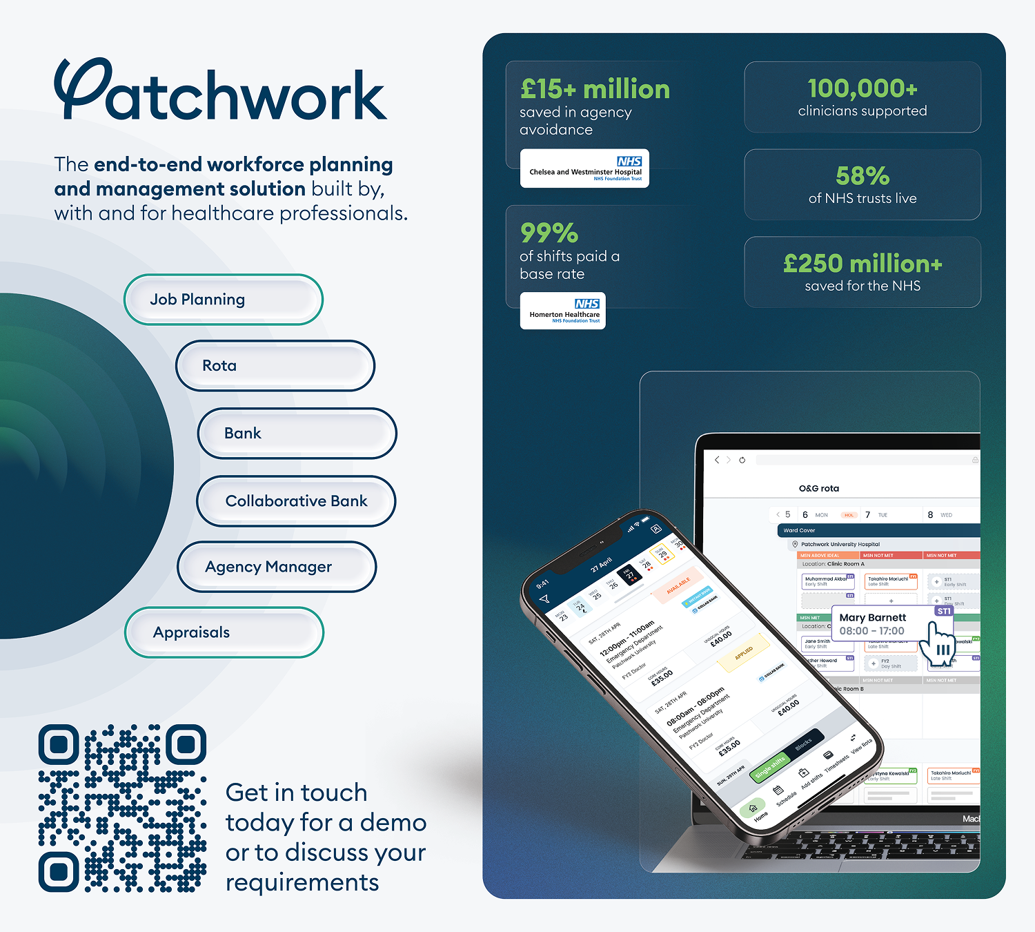
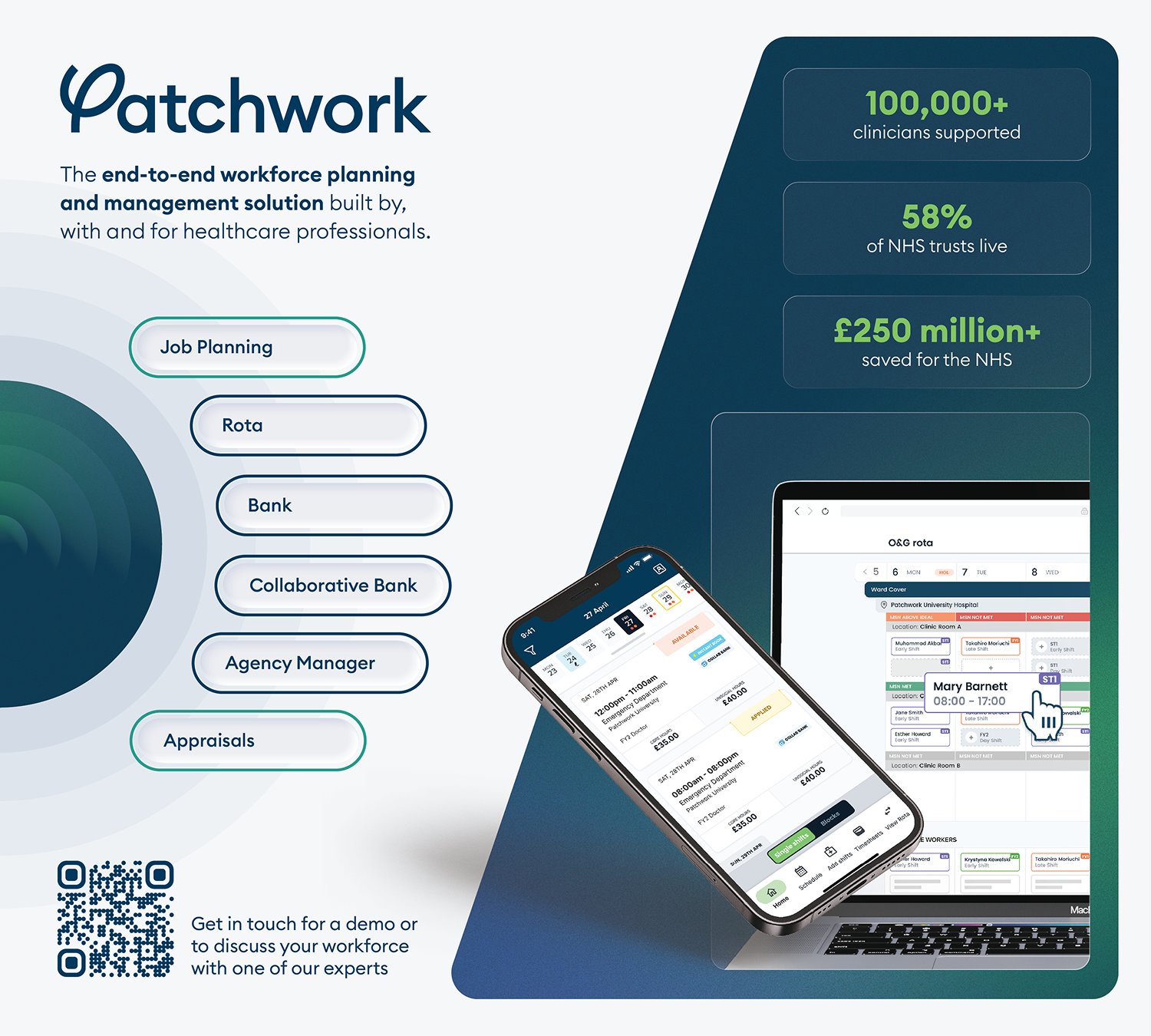
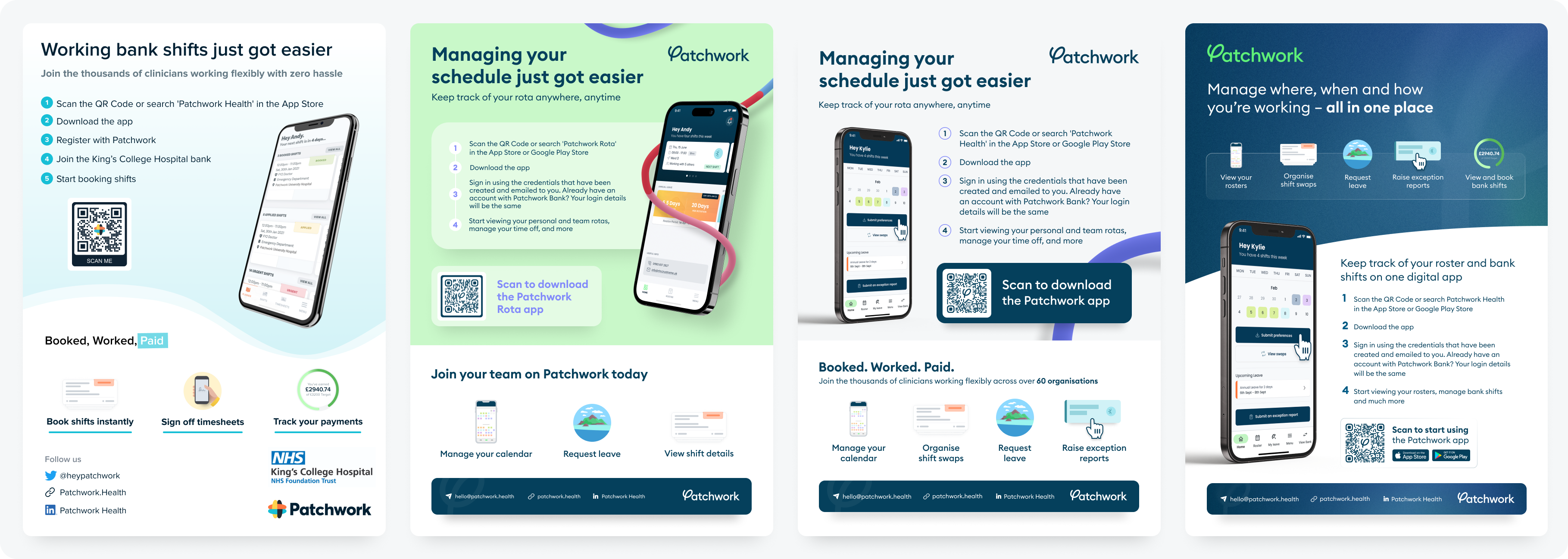
Patchwork Health is a healthcare technology platform helping organisations manage staffing challenges. I joined the company shortly before a full brand rebrand, where I was heavily involved in the process alongside the external branding agency, contributing as the in-house sole designer and providing insight into how the new identity would be applied across marketing, product, and digital experiences. Following the rebrand, I took ownership of evolving and implementing the brand across the business, working closely with internal teams to develop a scalable visual system. From creating brand guidelines and marketing assets to shaping digital experiences and campaigns, I helped ensure the refreshed identity remained consistent while allowing Patchwork to stand out within the health tech industry.
Creating a scalable brand system
the problem
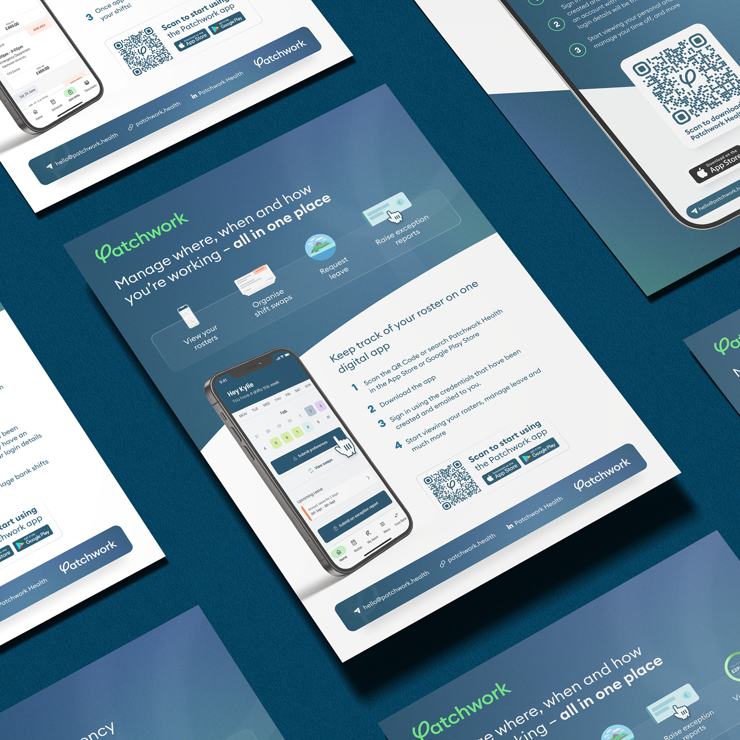
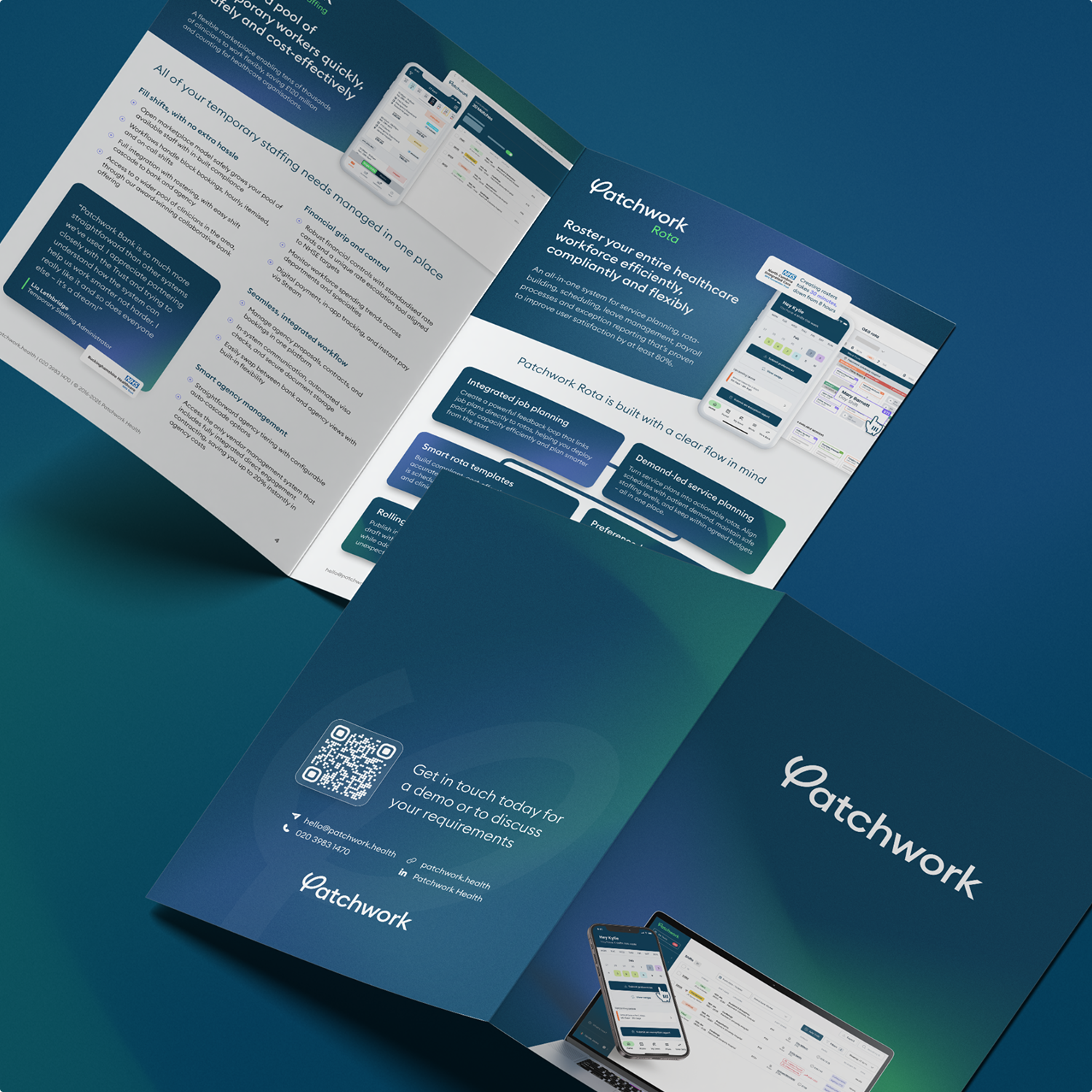
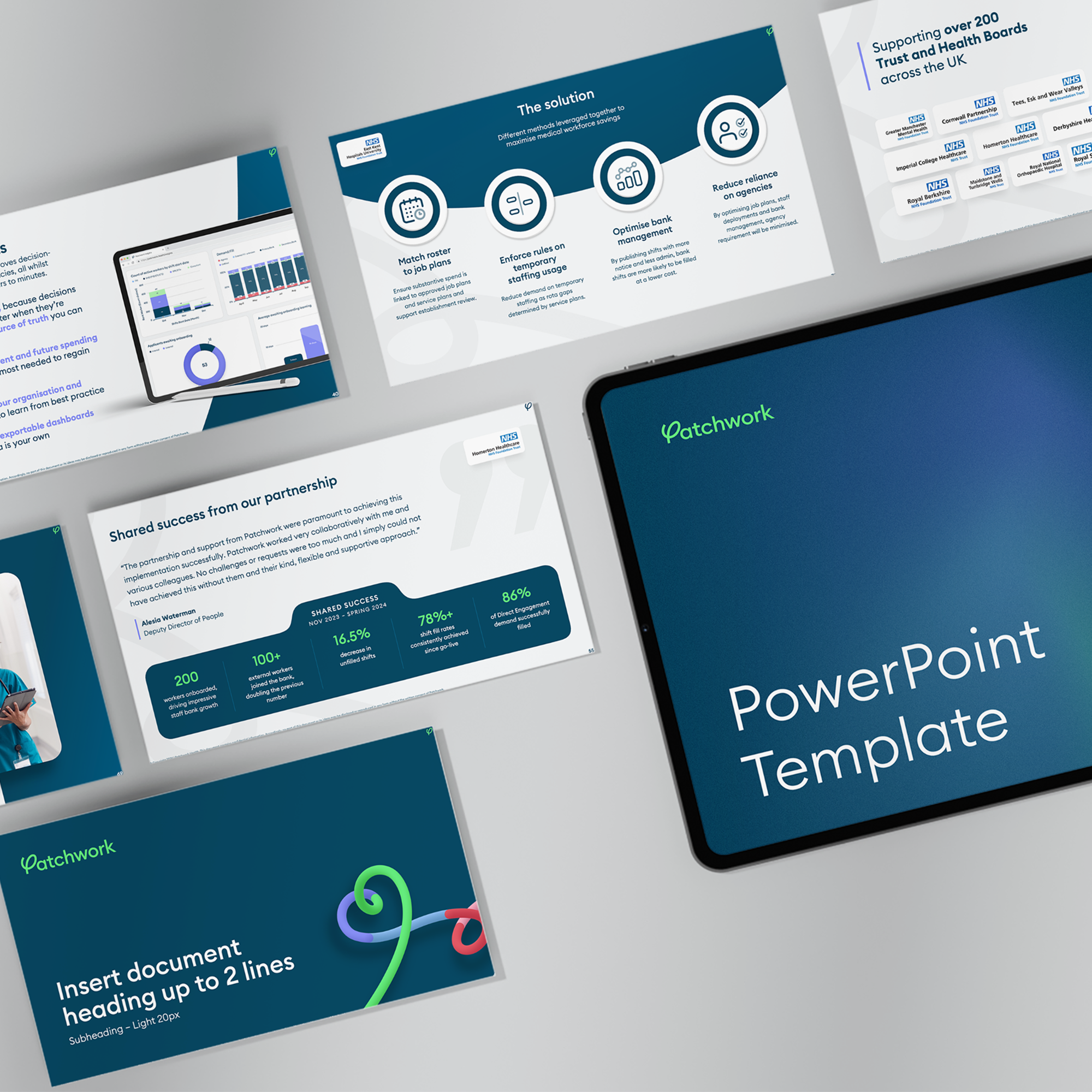
I led the implementation and evolution of the brand across the business, working with internal teams and senior stakeholders to create a scalable design system. I developed new brand guidelines, marketing assets, templates, and digital experiences that brought the refreshed identity to life across multiple touchpoints.
the soltuion
Following my involvement in Patchwork’s rebrand, the company needed to evolve its visual identity overtime into a more distinctive and scalable system. The challenge was creating a modern brand presence that stood out in the health tech market while remaining consistent with the existing identity.
Old vs new brand
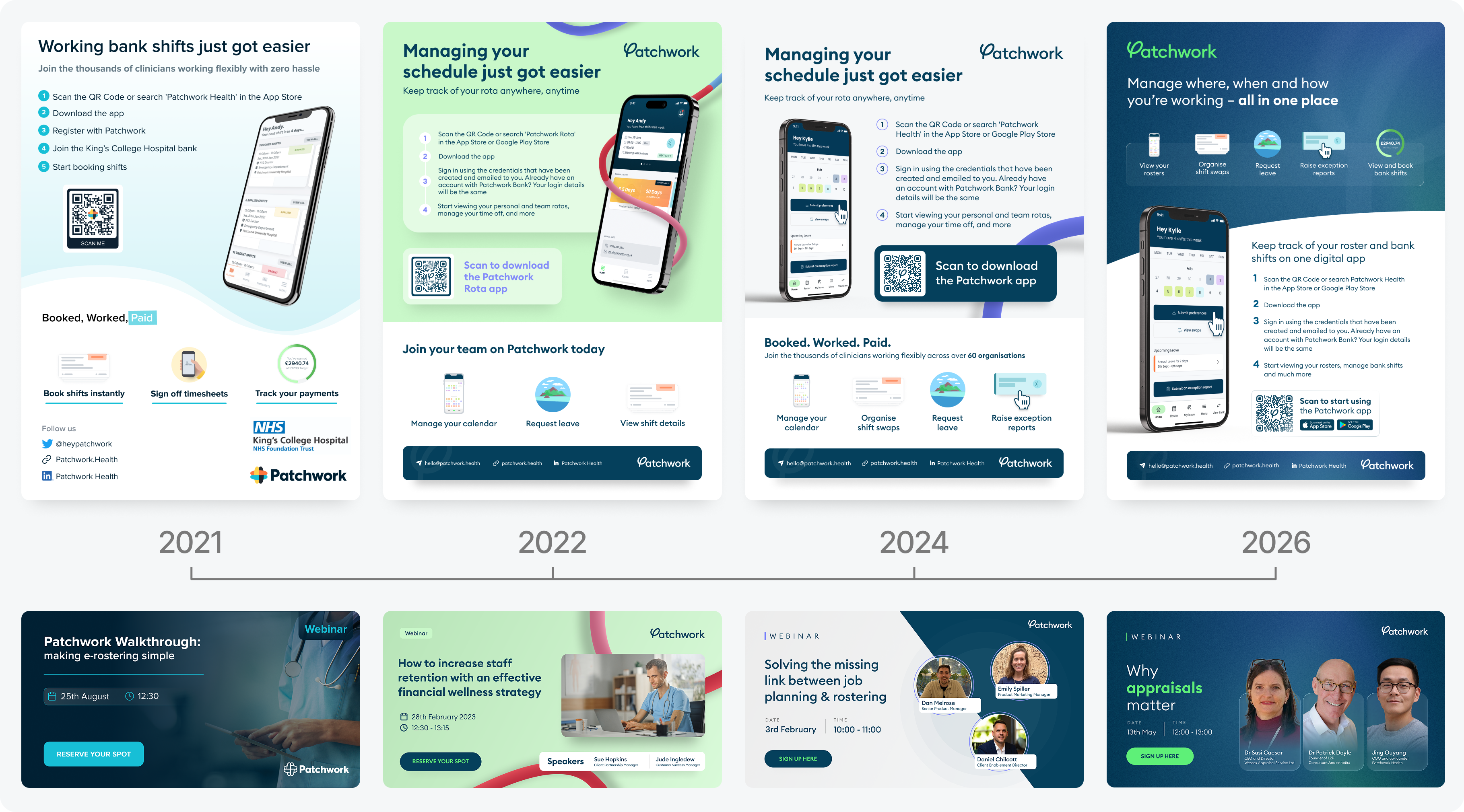
Over my 4 years at Patchwork, I’ve been heavily involved in the evolution of the brand, helping shape how the identity developed across both print and digital experiences. These examples showcase the progression from the original brand, through the rebrand implementation, to the more recent visual refresh, highlighting how the brand has grown strategically while maintaining consistency across every touchpoint.
Communicating the brand through visuals
the problem
the soltuion
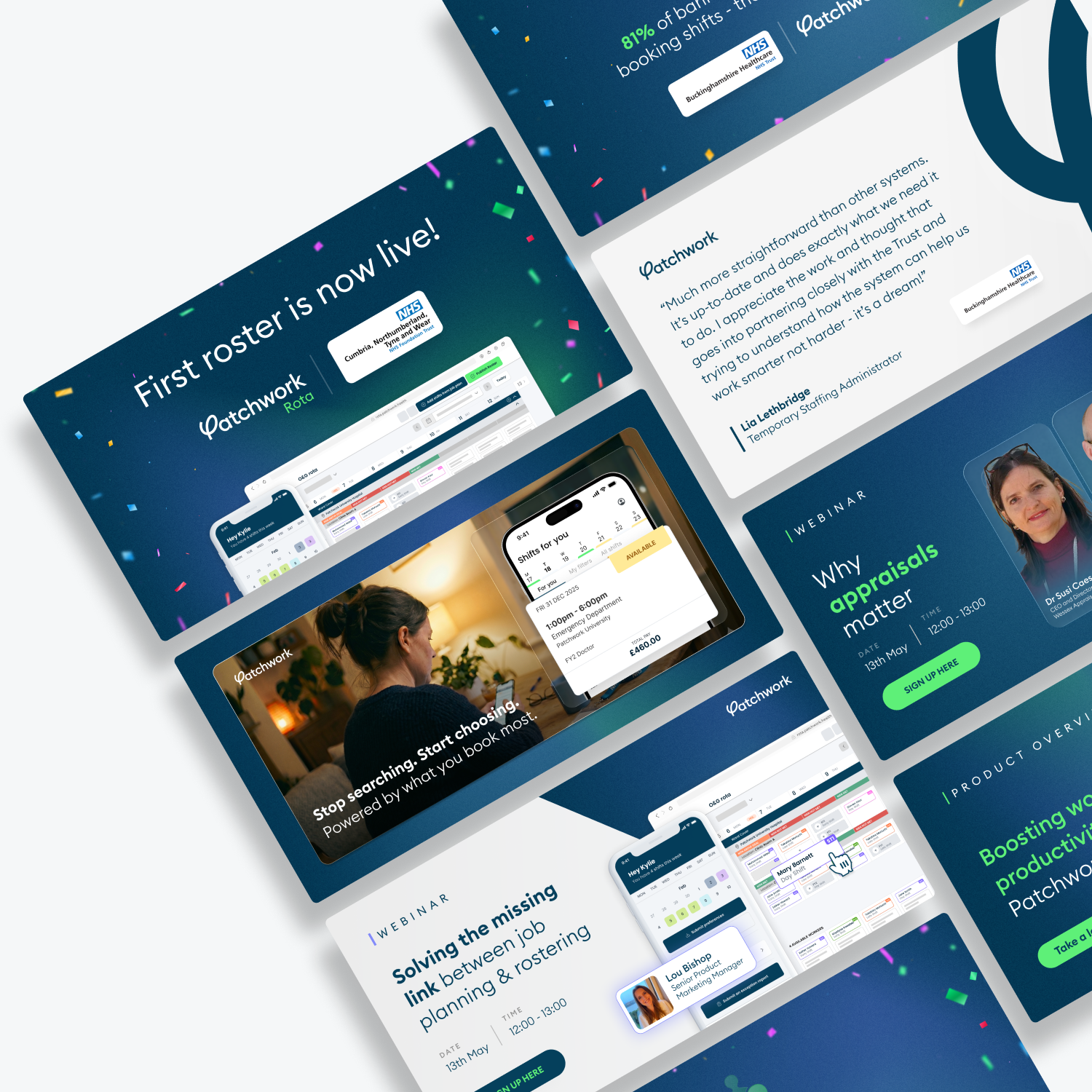
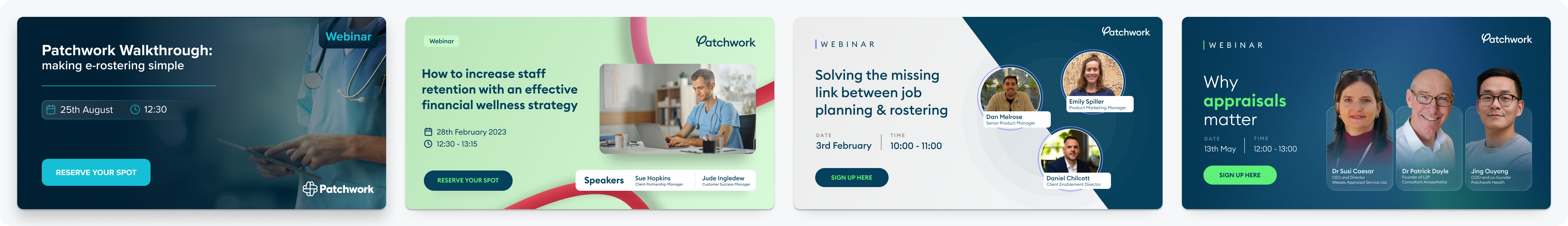
As Patchwork grew, there was a need to communicate complex healthcare solutions in a clearer and more engaging way. The challenge was creating marketing assets that felt distinctive, aligned with the refreshed brand, and could effectively communicate with different audiences.
I created a range of marketing collateral and campaign assets that translated complex messaging into clear visual communication. Working closely with Marketing, I developed designs across digital and print channels that strengthened brand consistency and helped the business communicate more effectively.
Video production
Patchwork needed a way to clearly communicate the value of its product and demonstrate how it solves real challenges for healthcare organisations. I directed and edited a value proposition video that brought together multiple perspectives, including leadership and product teams, to create a clear and engaging narrative. By shaping the story, editing the content, and developing the overall visual approach, I helped communicate the product’s impact while strengthening Patchwork’s position as a trusted healthcare technology product.
Website redesign
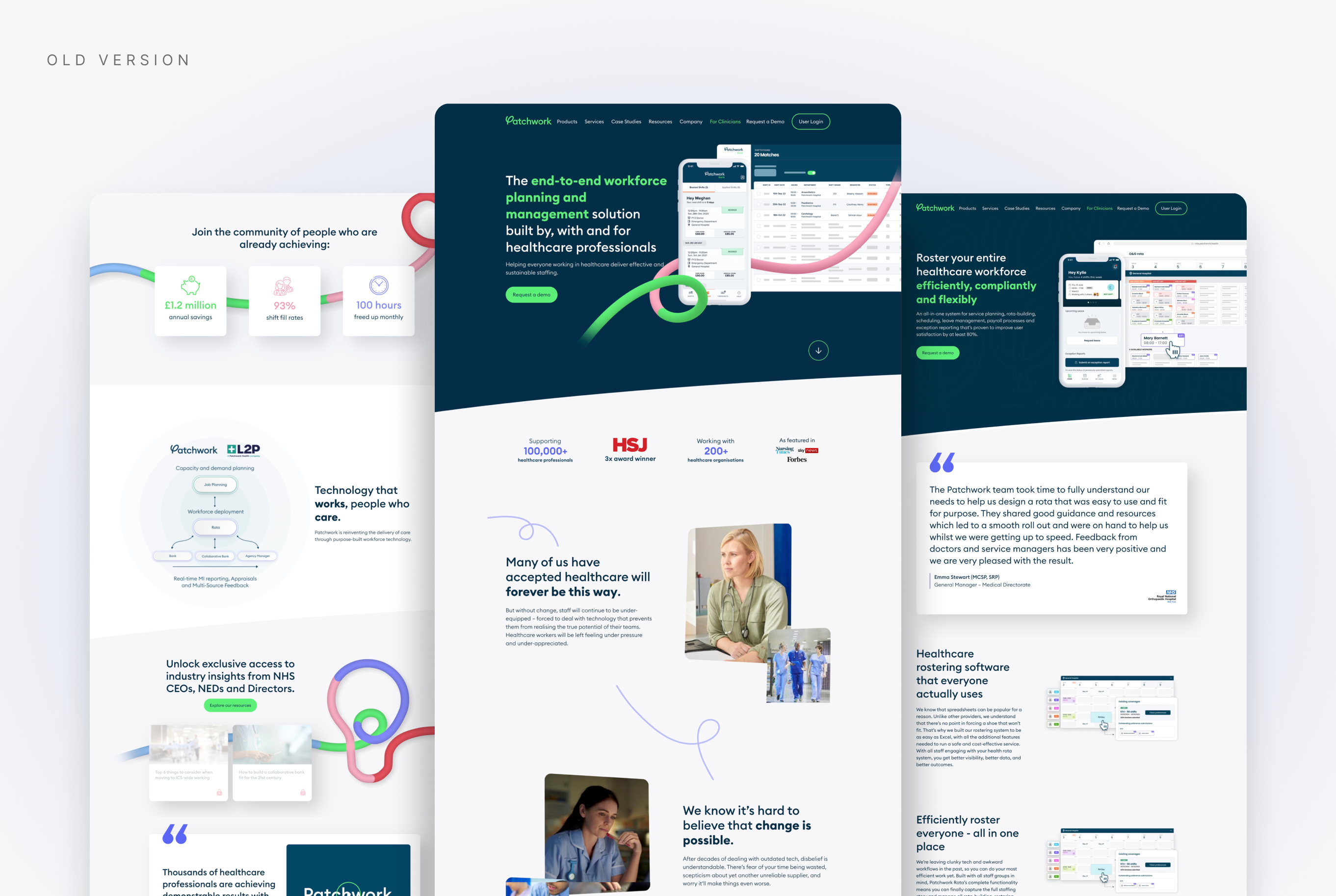
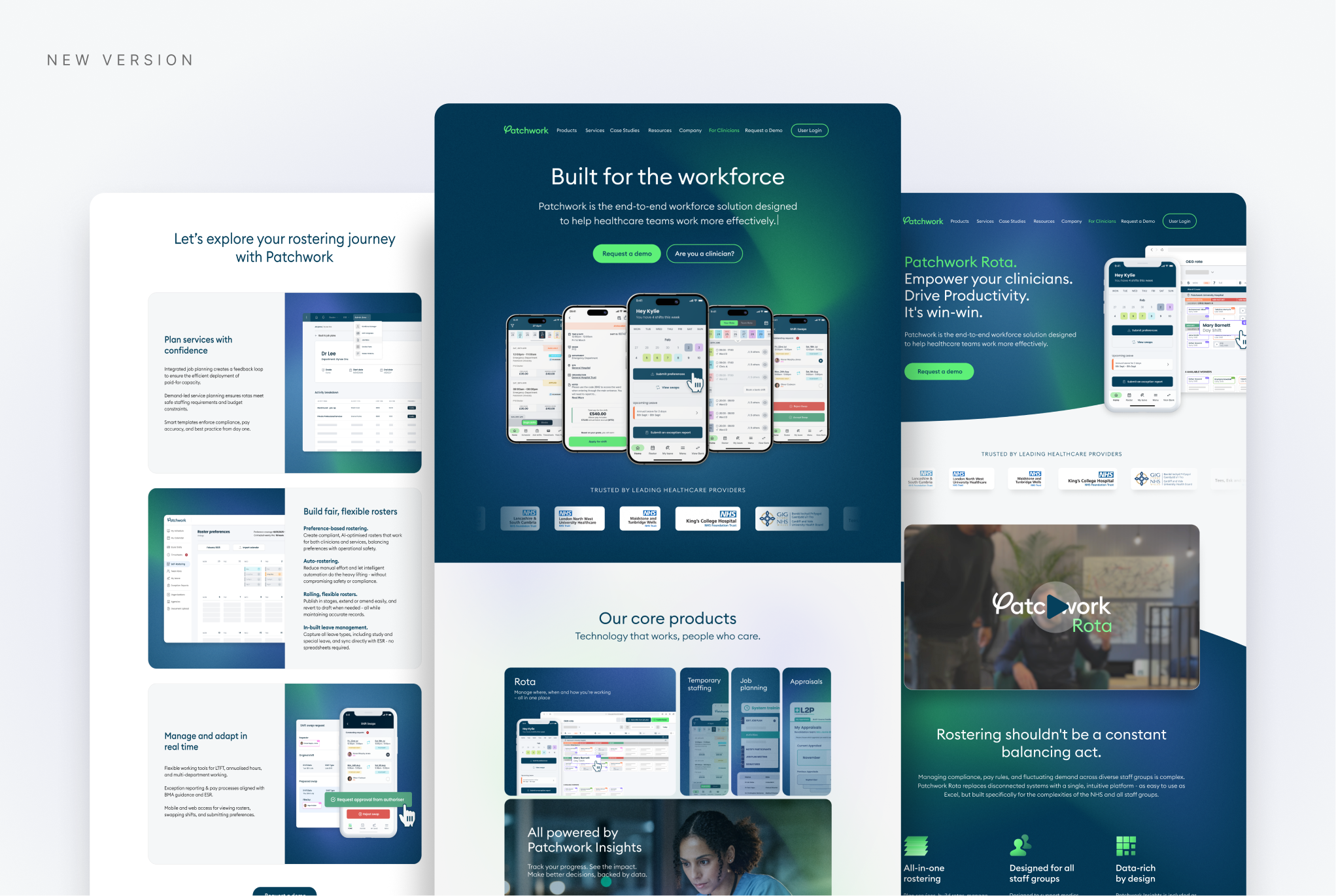
Patchwork’s existing website no longer reflected the direction of the business, with unclear messaging, limited user journeys, and a dated visual experience that made it harder to communicate value to key audiences. With the brand evolving and the integration of a recently aquired company, the redesign became an opportunity to create a stronger digital foundation that aligned with the company’s future growth.
Working closely with Marketing during the research phase, I led the design direction of the website redesign, focusing on improving the user experience, clarifying messaging, and creating clearer journeys for clinicians, healthcare managers, and decision-makers for trusts. Within HubSpot’s platform limitations, I designed a scalable system with stronger hierarchy, improved calls-to-action, and flexible layouts that supported future campaigns, product launches, and content growth.
Extending the brand into physical experiences
the problem
the soltuion
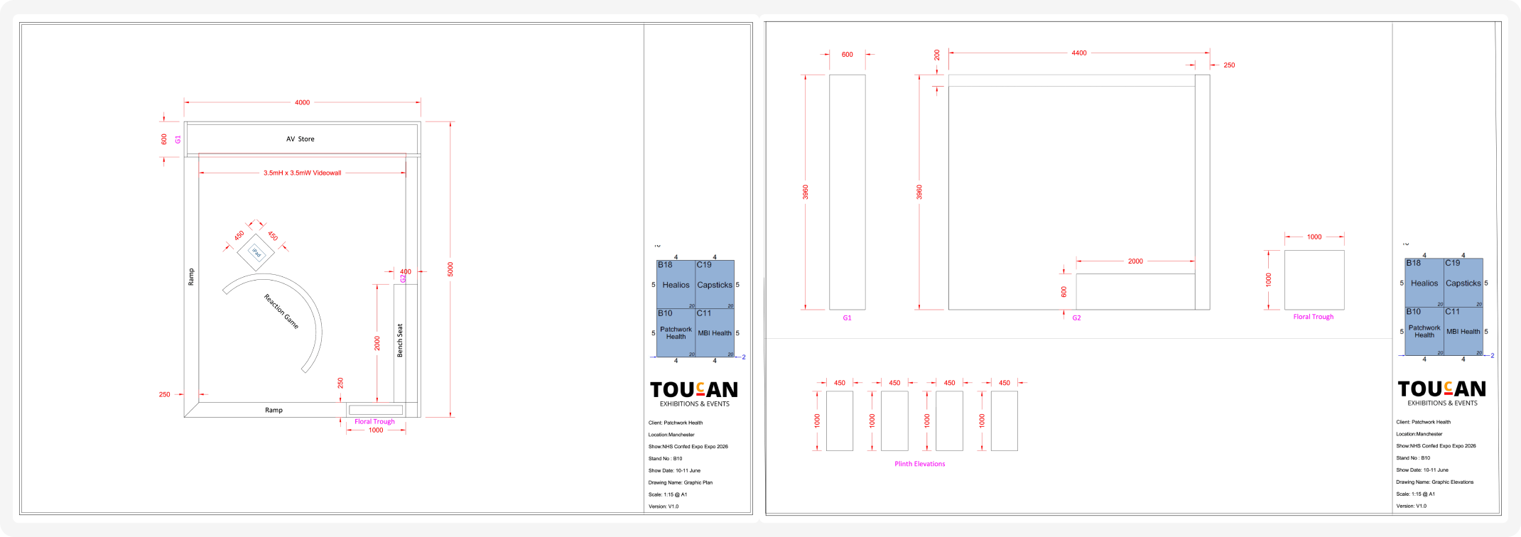
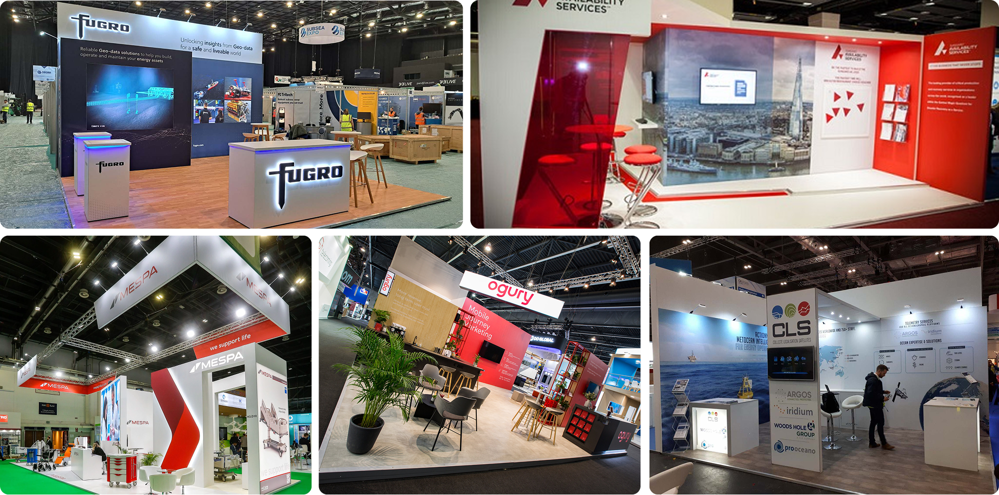
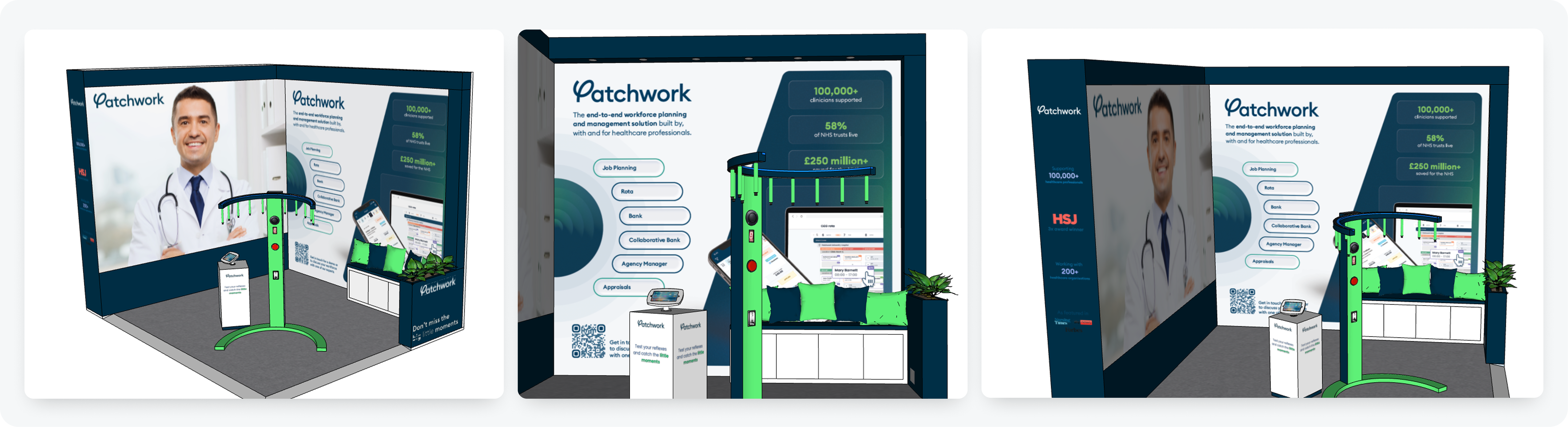
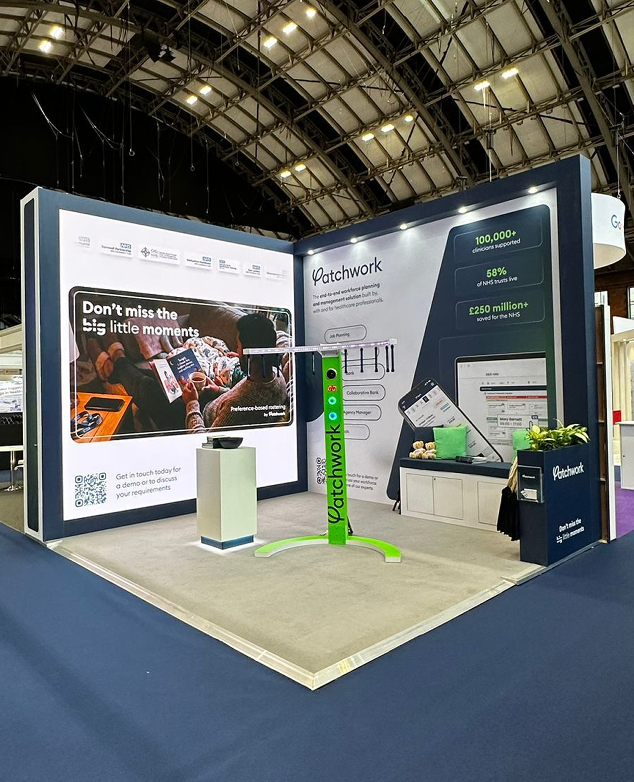
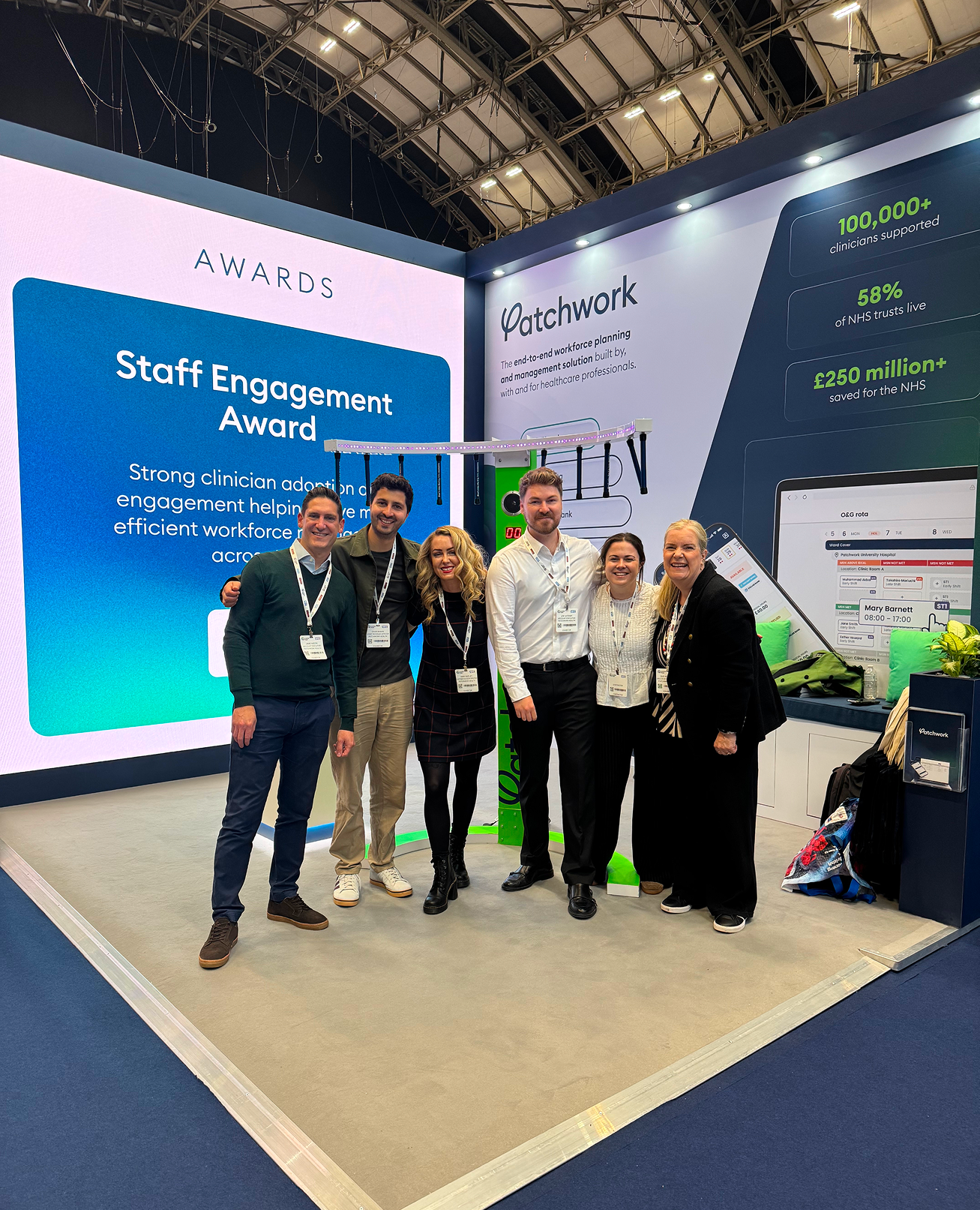
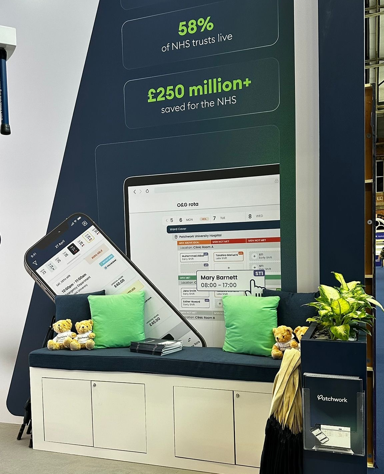
As Patchwork expanded its presence at industry events, the brand needed to create stronger physical experiences that could communicate its value beyond digital platforms. For NHS ConfedExpo, the challenge was designing a stand that could stand out in a busy environment, engage healthcare decision-makers, and quickly communicate Patchwork’s products, expertise, and impact.
I led the creative direction for the stand, collaborating with the event supplier to translate the refreshed brand into a physical experience. Through large-scale visuals, motion content, product storytelling, and an interactive “Catch It” game, I created an engaging stand experience that communicated Patchwork’s offering, encouraged visitor interaction, and helped strengthen the brand’s presence at NHS ConfedExpo.
Technical drawings and blueprints
Inspiration moodboard
wall Design options
final design mockup
NHS Confed Exo stand images
Brand Strategy
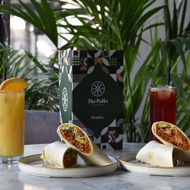
I had numerous meetings with the founder and restaurant manager in order to extract the most valuable insights, building a strong foundation. The problem we had was the brand positioning and how they wanted to be perceived as a brand as it was a modern and contemporary restaurant but at the same time didn't want to seem too expensive and luxurious which would discourage our target audience. Creating multiple user personas for the brand helped solve this problem and nail down the exact type of audience. The brand purpose was "creating awareness for west African culture and cuisine", along with the vision to showcase "Nigerian culture in a modern light and help people integrate it into their lifestyle".
Upon this, we built a brand identity system that reflected their core values being, family, consistency, passion, price, and respect.
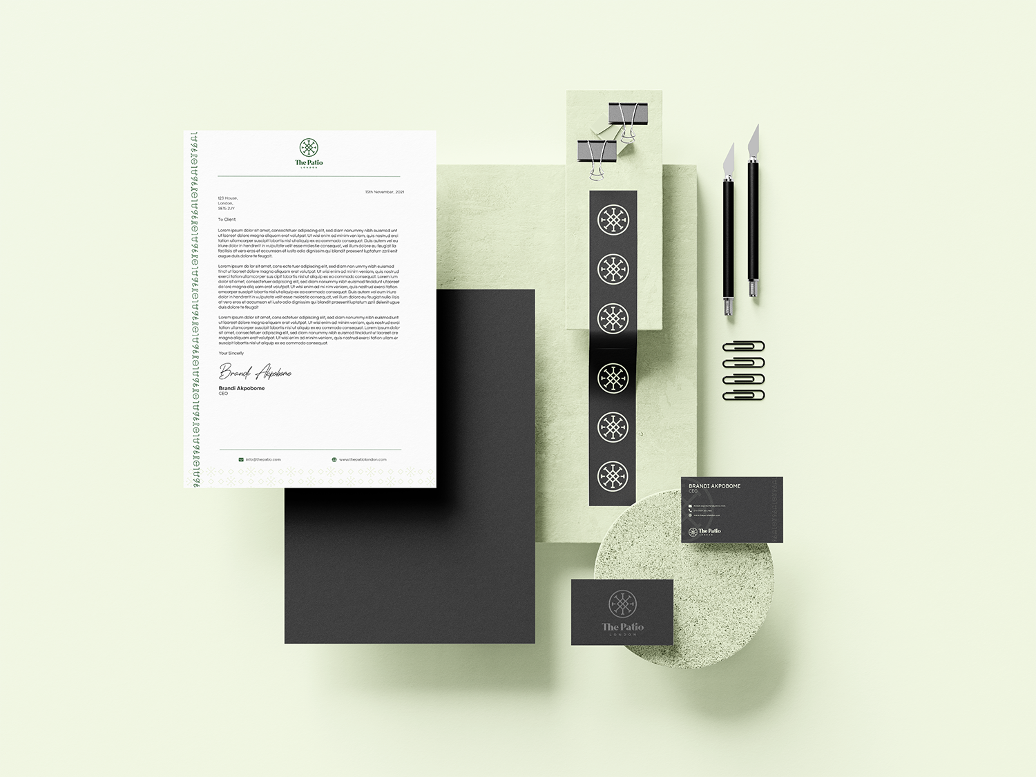
Logo & Brand Identity
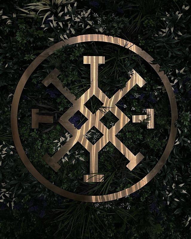
When speaking to the client, they wanted the logo to feel authentic but have a slight retro feel to go with their target audience and aesthetic. We ended up going with an Nsibidi inspired emblem, which is an ancient west African language. The emblem represents "Love" and "Meeting one another". After their values, strategies and goals were in place, we formed an identity that uniquely tells the story of The Patio London.
Logo concepts
During the logo process, there were a lot of amends and revisions needed to achieve the final logo. The main ideas that the client had in mind was the retro/modern style font, along with the Nsibidi themed emblem.
Colour palette
From the mood board and brand strategy that was created, the colours for the brand represented the Nigerian culture, along with a nature/charcoal aesthetic to it, which would soon be implemented into the restaurants interior.
final logo
A logo doesn't just have 1 layout but multiple different options for different use-cases. These included the full logo, the emblem, and the word mark.
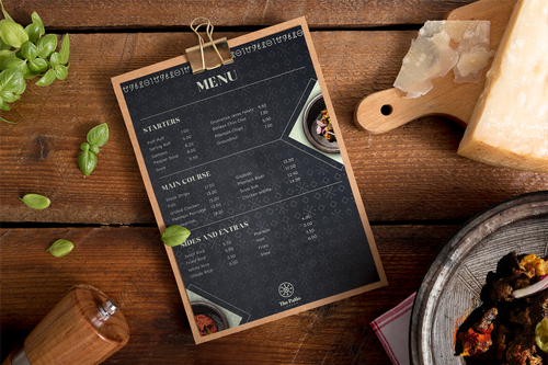
Brand patterns
The brand patterns would be used on all channels, including social media, interior designs within the restaurant, on products as well as collateral in general.
Graphic elements
The graphic elements were inspired by the retro style and would be mainly used for social media and video transitions, as well as certain areas within the restaurant.
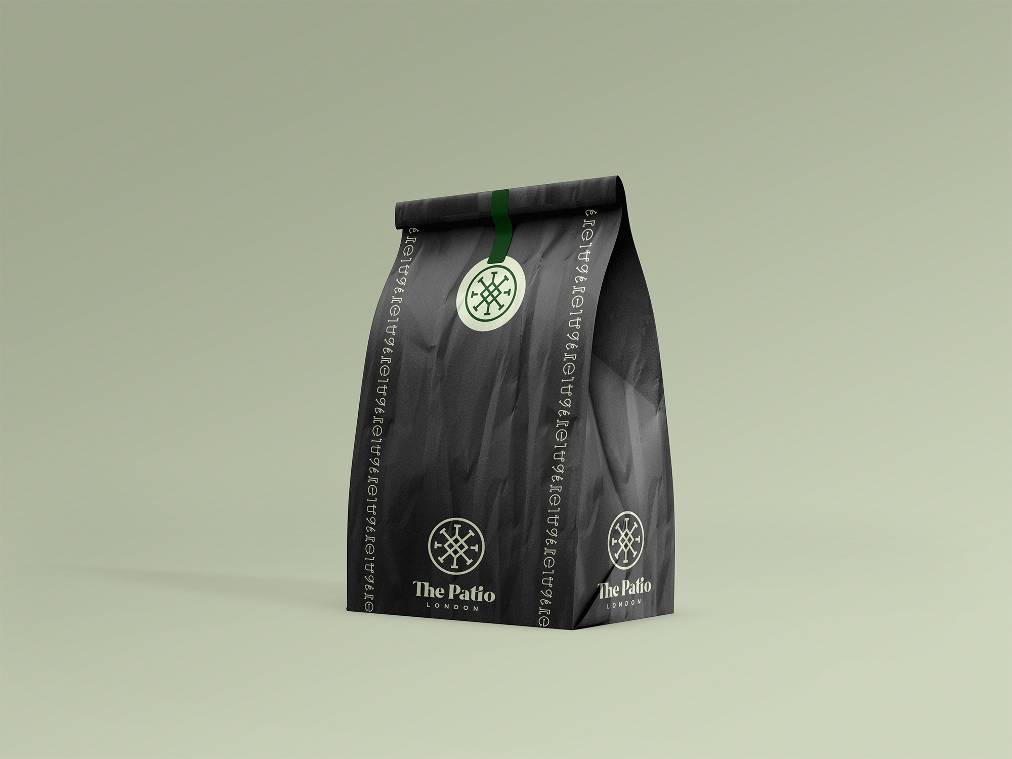
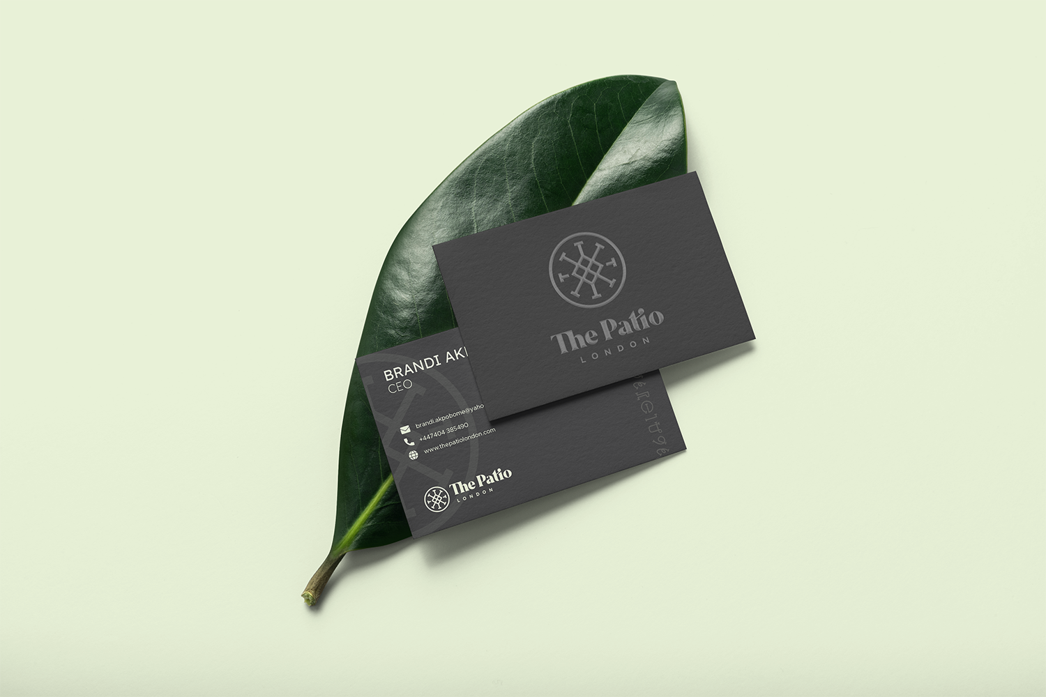
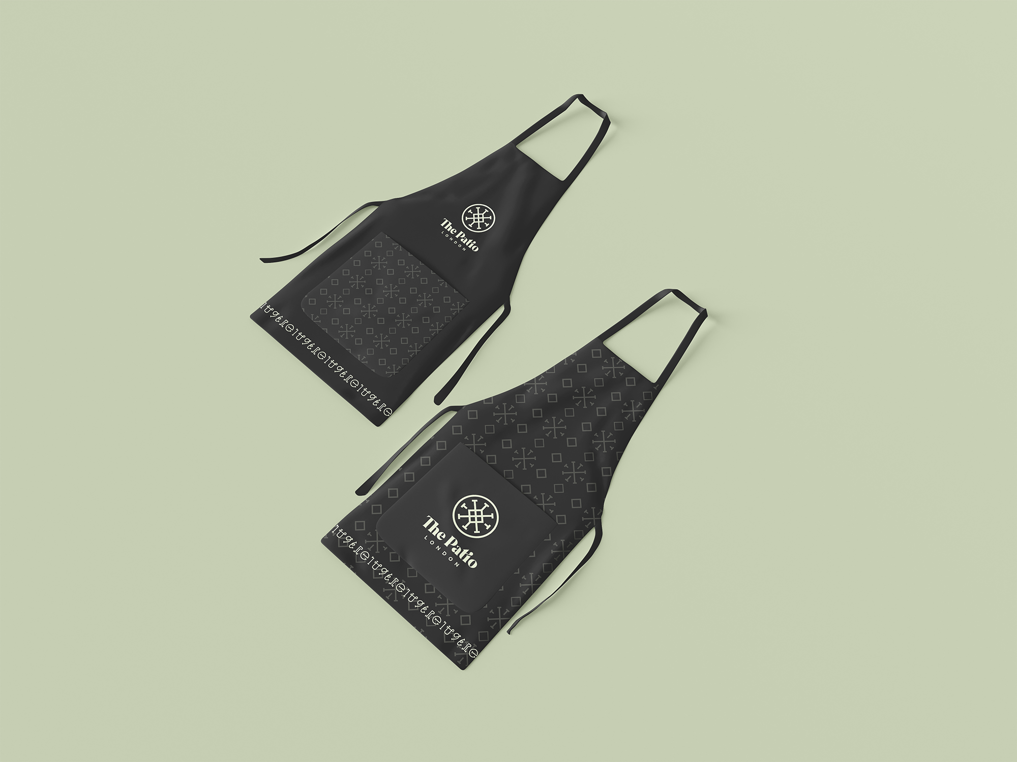
Brand mockups
Brand mockups help visualise how the brand's identity looks once each element is placed together as one. I put designed specific mockups that related to the clients restaurant, which was later on used for their stationary and inspiration for their aprons.
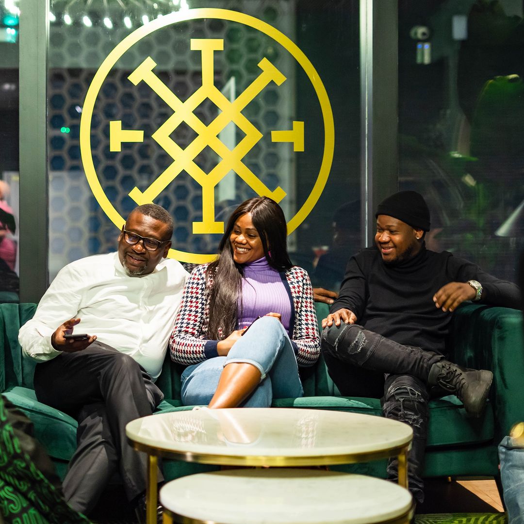
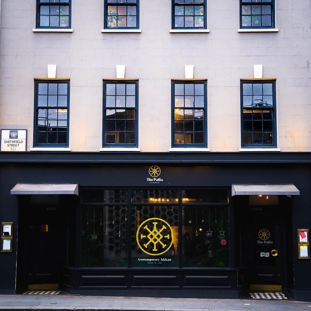
Brand Launch
The restaurant launch was a huge success, with it's large emblem printed on the window at the front of the restaurant, represnting family,
Building the brand foundation
the problem
the soltuion
Following my involvement in Patchwork’s rebrand, the company needed to evolve its visual identity overtime into a more distinctive and scalable system. The challenge was creating a modern brand presence that stood out in the health tech market while remaining consistent with the existing identity.
I led the implementation and evolution of the brand across the business, working with internal teams and senior stakeholders to create a scalable design system. I developed new brand guidelines, marketing assets, templates, and digital experiences that brought the refreshed identity to life across multiple touchpoints.
Old vs new brand
Over my 4 years at Patchwork, I’ve been heavily involved in the evolution of the brand, helping shape how the identity developed across both print and digital experiences. These examples showcase the progression from the original brand, through the rebrand implementation, to the more recent visual refresh, highlighting how the brand has grown strategically while maintaining consistency across every touchpoint.
moodboard
Logo Sketches
From the mind map that I created, I sketched a few designs on paper, putting out whatever came to mind. From this I replicated my top designs on Adobe Illustrator and moved on from there.
Logo Process
From the logo sketches, the process from the initial logo to final logo design took place. I experimented with shape, colour, layout and typography.
Colour Palette
From the discovery session, I knew the preferred colours would've been red, as the dominant colour, and navy blue as the secondary colour. I wanted the red to be quite bold and vibrant but at the same time not too vibrant to the point that it would not be aesthetically pleasing, as well as having a dark contrasting colour.
Main Logo
Brand Patterns
The brand patterns would be used on all channels, mainly collateral and social media.
Website Design
A 5 page responsive website was created using Webflow, with the aim to give potential clients a better understanding of the services provided by Petadesk, as well as a way of getting in touch.
A set of social media posts and graphics were created to have a social media presence and built more trust through potential clients. The social media assets were created for both Instagram and Facebook, as well as launched Facebook ads to help promote the business and the services offered. The motion graphic video was created using After Effects.
Brand Mockups
The mockups are examples of how the elements from the brand identity can be applied to products and collateral.
No items found.
Logo and Brand Identity
From the discovery stage with the live client, the overall aesthetic of the brand aimed to give off a feeling of warmth, friendliness and being welcomed. This was due to the fact that the customers of the app would need to have an initial feeling of trust as this was one of the core values within the brand.
Logo Process
The logo process began with sketches on paper which was followed by designs on illustrator. There were many amends and changes involved but with the main idea being a minimal design that had the letter "P".
Colour Palette
The primary colour being turquoise represents calming, friendship, love, joy and loyalty. This is important as the brand personality is relaxing, friendly and calm. This represents the guests feeling relaxed when booking their villa through the app as they know there won’t be any issues or problems, resulting in loyalty from both the guests and the brand.
Final Logo
The logo process began with sketches on paper which was followed by designs on illustrator. There were many amends and changes involved but with the main idea being a minimal design that had the letter "P".
Mission Statement
The mission at Petadesk Property is to promote fairly through affordable and flexible vacation rental.
Vision Statement
Petadesk Property wants to provide a trusted and affordable accommodation for its customers who rent and want their accommodation managed by Petadesk Property, as honesty is their virtue and marketing is vital during the transaction process.
Brand Personality
The personality of Petadesk Property is relaxed, friendly and calm. This represents the guests feeling of being relaxed when booking their villa through the app as they know there won’t be any issues or problems.
Application Design & Prototype
During this stage, I designed and created a prototype of the app using Sketch and InVision. My aim was to design an app that was efficient and easy to use for customers who want to go on holiday and book a property to stay at. This was accomplished by creating wireframes, designing and doing multiple drafts of the app to reach a final app prototype, along with usability testing to get feedback on what things are good, bad and needed to be improved.
Site Map
After conducting my research on other holiday property apps such as Airbnb, I created a sitemap to help myself understand the main pages that would be included in the app and how the user would navigate throughout the app seamlessly.
Wireframe Sketches
From the sitemap, I created wireframes of the app which included some of the first few pages that the user would experience when going onto the app, giving me an idea of how the overall aesthetic would look.
Low-Fidelity Wireframes
A set of wireframes were created on Sketch for the first few pages to see how it would be laid out digitally.
First Draft
A first set of drafts were created. I liked the overall aesthetic and layout of the app but I felt that some brand identity was missing.
Second Draft
In this iteration of my application, I enhanced the brand identity throughout the app, making the colours and background designs more apparent to the user.
Final Design
The final prototype was done after I did my usability testing in my 2nd Draft to get feedback on the main pages from my wireframes. After getting the feedback I made the changes, as well as added a few other duplicate pages but with different information to enhance my prototype. There were a few design changes done to the final prototype but not as much as I thought there would be compared to my 2nd draft.
One of the main changes being done to being pages added after the splash screen to give a short description on each page of what the user will expect from the Petadesk Property app with the main purpose of the app. This would help the user get a quick sense of what the app provides before entering in case there is any uncertainty or confusion.
As well as the app prototype, I created a 360 marketing campaign to get a better understanding of how the app could be promoted to the specified target audience if the app was to be published.
Target Audience Insight
As well as market research, I used Facebook Insights to give me a more specific audience for my campaign, both outdoor and on social media. From the Facebook audience insights, I have decided to focus my target audience on young adults of both genders, between the ages of 18-30 as most of the demographic are students and people who would office jobs, primarily in London.
As Petadesk Property is not a high end of luxury holiday lettings app, most properties would be affordable for their budget and salary. In addition, the imagery used on the campaign would be aimed towards friends as the majority of the users were single, meaning they would prefer to go on holiday with friends, especially as they’re also young adults.
Moodboard
Campaign Examples
Campaign Mockups
I made the final posters have a tinted box in the centre of the screen with white and dark turquoise text in front to keep everything consistent as it doesn’t matter what image is behind the box, the text will always be visible. I also made the main text bold and dark turquoise but highlighted the main words in white to make it stand out and give some contrast and dynamic in the poster, improving the overall readability of the text. With the messaging, I made sure to portray the message of what the users could do with the app and experience through Petadesk Property without being too direct.
I think this messaging works well for getting the main message across, along with a message at the bottom of each poster telling the viewer to “Book a property with us today”, with “Property” highlighted. In addition, I wanted to make the message quite bold and concise as many people in London on public transport are always on the move, making their attention span on adverts quite short, unless they are sitting on the train or waiting on the train.
The mockup images were photos that I took going from Uxbridge to central London, which I then edited using Photoshop.
No items found.
Bringing a new product to life through motion
THE CHALLENGE
As a newly developed product, Name That Player needed a way to introduce itself to football fans and quickly communicate what made the app engaging. The challenge was creating a promotional asset that could capture attention, explain the experience, and encourage users to download the app.
With the main placement being at Watford Football Stadium, the advert needed to communicate the concept quickly within a fast-paced environment where audiences had limited time to engage.
The approach
With creative freedom from the client, I developed the concept and visual direction for the advert, focusing on capturing the competitive and entertaining nature of the app.
I began by understanding the user journey and identifying the key moments that would make the app engaging. I then created a storyboard to map out the narrative, pacing, and visual flow before moving into animation.
THE solution
As a newly developed product, Name That Player needed a way to introduce itself to football fans and quickly communicate what made the app engaging. The challenge was creating a promotional asset that could capture attention, explain the experience, and encourage users to download the app.
With the main placement being at Watford Football Stadium, the advert needed to communicate the concept quickly within a fast-paced environment where audiences had limited time to engage.
The outcome
The final advert supported the launch of Name That Player across key promotional touchpoints, including Watford Football Stadium. Following launch, the app achieved a 4.2/5 rating on the Apple App Store and saw strong growth in downloads, helping introduce the product to a wider football audience.
This project allowed me to take ownership of the full motion design process, from concept development and storyboard creation through to final animation delivery.